


Photos: Penlight Media
One of my clients, Cindy Bradley, called with a custom painting request as a surprise gift. She was finalizing the renovations of her coastal home and wanted to have an impressionist seascape created that would perfectly match the colors of their newly revamped space.
With a keen eye for detail, she explained her vision for a statement piece to hang above her soaking tub, with the same color palette she had selected with her interior designer. I was excited to match the painting note by note, color by color, to the textures, fabrics, and materials in the space to mirror the room's color spectrum. THIS is exactly the kind of work I love to collaborate on.

Project kickoff ~ off Developing Concept
To kick off the project, we spent time in her home, delving into discussions about color schemes, aesthetics, vibes, and the overall ambiance she envisioned. The location for the scene she had in mind held deep sentimental value for her family, and she had a size in mind already. Her request was clear – a bold impressionist stroke that would toe the line between reality and abstraction.
Her recently transformed space provided an ideal canvas, adorned with coastal furnishings and artworks by Ann Duffy, laying the foundation for a color palette dominated by rich marine blues and soft naturals.
Together, we ventured to the chosen location, capturing reference pictures for inspiration:

Refining Composition & Finalizing Colors:
Back in the studio, I crafted several preliminary composition sketches and a color palette, presenting them to her in the space for evaluation. She pinpointed the colors she wanted to shine through, and after careful consideration, we settled on a sketch. 

Final Results:
In the final painting, I incorporated Cindy's selected colors while ditching the ones that didn't quite make the cut. The end result is a perfectly customized painting that artfully pulls together notes from the whole interior design, including wall tile, floor tile, lighting fixtures, colors, subject and painting style. Now the painting hangs in harmony in the space, complementing the interior design while serving as a testament to the unifying power of art.


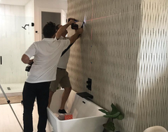
Installation
I enlisted the help of Suncoast Installs to hang the painting. The luxury bamboo tile posed a drilling challenge, but their specialized equipment for delicate materials made the process a breeze. In less than 30 minutes, the installation was complete, and the painting found its new home.

In Cindy's Words:
After the installation with was complete, Cindy described the whole experience, "I hired Anne to paint a custom piece of a favorite scene at Fort De Soto to match the turquoise colors of my bedroom. She went on a few location scouting trips and then created a mini version so I could approve the colors and dimensions prior to working on the final masterpiece. Then she set about adding in more of the colors I really loved, while removing those that I didn’t care for as much. I was able to approve the work in phases, so I was in the loop the whole time. The final piece is absolutely perfect. I love it!"
Curious about commissions? Click here to learn more.
Here are more ways you can follow my work and become a collector:
- Sign up for premium access to new artwork and member only pricing. It’s free and a nice place to spend time checking out new art as it is created.
- Interior Designers, sign up here for art & ID related updates and collaboration opportunities.
- Give me a follow on Instagram to see my work coming to life in real-ish time. The more audience that shows up, the more content I will produce.
- Check out my 2024 events list and mark your calendar. I update this list as things are added, so come back often.


